cambridgeshire canary 6,811 Posted August 27, 2021 Now here's a throwback for the older posters on here 😉 Much as I do prefer these and think most of them look good and some even better than todays (Such as Bristols.. So much better than what they have today) some are a bit amusing. You gotta love Barnsley. Share this post Link to post Share on other sites
Yobocop 1,105 Posted August 28, 2021 2 hours ago, cambridgeshire canary said: Now here's a throwback for the older posters on here 😉 Much as I do prefer these and think most of them look good and some even better than todays (Such as Bristols.. So much better than what they have today) some are a bit amusing. You gotta love Barnsley. Blackburn’s is the same and hulls looks like the rugby clubs one Share this post Link to post Share on other sites
cornish sam 966 Posted August 28, 2021 6 hours ago, Yobocop said: Blackburn’s is the same and hulls looks like the rugby clubs one The fact it says "Rugby League" on it is a slight give away... Share this post Link to post Share on other sites
Cantiaci Canary 558 Posted August 28, 2021 Yes, the medievalesque fussier styles of yester year are superior in my humble opinion. But simpler designs for global marketing have knocked a lot of character out of them in recent years. Share this post Link to post Share on other sites
Mello Yello 2,303 Posted August 28, 2021 ...🎵"He rode a blazin' saddle" 🎵.... Share this post Link to post Share on other sites
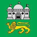
TheGunnShow 6,019 Posted August 28, 2021 Some pretty mediocre ones in there, IMO. I like how a lot of modern ones are quite crisp and clean and enable ready identification, but the issue I have is they are a bit "identikit" which does essentially rob them of character a little. That Luton one is crap (current badge is pretty good, and I like the hat they lobbed in there) and the Reading one is just incredibly uninspired. Blackpool and Blackburn make my eyes go Japanese trying to read who they are. The Bournemouth one makes me think the former neighbour's slightly disturbed kid put the letters on, and probably decided to do the Millwall one as a side project. And the font on Bristol City's old badge looks like it needs 4.8% ABV next to it. Barnsley's was a cult classic though. I did like that one. Still not worked out what the green one in the top right-hand corner is. Share this post Link to post Share on other sites
FenwayFrank 2,469 Posted August 28, 2021 3 minutes ago, TheGunnShow said: Still not worked out what the green one in the top right-hand corner is. Plymouth Share this post Link to post Share on other sites
TheGunnShow 6,019 Posted August 28, 2021 (edited) 7 minutes ago, FenwayFrank said: Plymouth Was my first thought, but couldn't find it Googling. Must be a very early one indeed and not used for a long time. Even if it is, that current badge is a good one.A Brief History of the Plymouth Argyle Badge.pdf (greensonscreen.co.uk)Plymouth Argyle | Logopedia | Fandom Edited August 28, 2021 by TheGunnShow Share this post Link to post Share on other sites